Tuesday 16 December 2014

arts and crafts evaluation


Arts and crafts evaluation

I did a verity of secondary research including looking through books when I was looking for historical and contempary artists. Also I have used the artist’s pictures to either copy or add onto my work for example on my mood boards.

 I’ve also used Pinterest to update all my work onto. For my historical artists I decided to choose William Morris I like his work because of how it’s usually designed for wallpapers and how it’s done in a pattern and it’s really detailed and colorful and I thought it would be good to do my version of his work.

I put my mood boards together by taking different images of Picasso and Morris work from books and the internet and some I stuck onto my work to either copy or to take a part of it and carry it on and some I used the same media and some I used different media for example acrylic and water colour.

I decided on my contempary artist because I was told by my tutor that Picasso was a contempary artist and with Picasso being well known I knew it would be easy to find his work so i have more of a variety to choose work I like.

Experimentation I have done throughout the project are textile experiments like batik, where you get hot wax and paint it on your drawing with a tjanting and then leave it to dry and you the do over it with ink which then leaves the wax clear so then you iron the wax off to leave the pattern. Also mark making where you paint your pattern using equipment apart from a paint brush so sponge, pegs etc. And also puff binding where you paint your pattern with cream paint and then dry it with a heat gun which makes it light and puffy.
The health and safety we covered in the workshop and processes included using the hot wax in the textiles room. We had to be carful that we didn't spill it on our self's or anybody next to us. So to prevent this we made sure there was a decent space between us so we wasn't working over the top of each other, also we had pieces of paper to catch the hot wax dripping out of the tjant till it got to out work. Another health and safety was using the craft knife when removing finished work from our boards to make sure that our hand or figures are not in the way of the  cutting direction. 
One of my peer feedback was to use primary  research but by the time I got the feedback our researching part was over so I know to use that next time. Another was to keep an eye on my time management and I managed to get all my work done for the deadline so I acted on that. 
One strength within my design was the scale of my work when I was taking ideas from Picasso and Williams Morris's work and putting them on my mood board I didn't do things too small or too big they where clear to see. I also liked the media I used for example when I was doing my studies and critical studies of Picasso and Morris I did one of Picasso's in impasto acrylic because that's what he had done I I choose It because I really like using thick paint and also Morris used mostly water colour so that's what I used and his patterns look really natural and not too in your face and that's how mine turned out so I was happy with my use of media. And finally I liked the final pattern which I took from William Morris and then added another one of his designs where it looked empty to create my final piece I liked it because it looked simple but really effective, especially when I had used the four textile techniques. 
If I was to do this project again I would choose a different contempary artist because I like Picasso but I couldn't fine anything that worked for my final piece. So maybe something that Interests me more. Also now I have and idea of what each piece of work has to look like I want to do more then the minimum requirement to get a better grade. 
Throughout my project I think that my final designs went really well because even though it was only two patterns from William Morris it looked really effective. I also think my critical study and study's of Morris's and Picasso's work worked really well because I used the same techniques and they really looked alike. I also thought my weaving which was one of our textiles experiments went well I really enjoyed doing it. However I think my final piece didn't look as good because it only the second time I had used batik, puff binder, mark making and sewing . I think my batik  and sewing went well but the mark making and puff binder looked messy and childish. 
I think I used my time well when doing work out side of college and in college time because if I had not finished one piece at college I would finish it at home. But if it had to be finished at college I need to work on that but I think we wasn't getting enough time on some of the work sometimes because we had to do the experiments In-between. 


Friday 14 November 2014

3d design workshop

For our first day in the 3d workshop we where experimenting with different techniques we could do. The first thing we started off with was the basics and we had to cut a shape out of a block of Mdf I used a coping saw so I could do curves because I decided to make a love heart. When doing this I made sure I put my hair in a bobble and took my lanyard off. After I had cut out the love heart I filed the eges to make it smooth and no bumps ect. This was my love heart.
After we moved on to mounting where you used a block of wood at different angles like this 
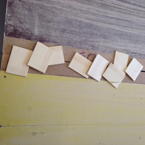
And then you get a thin strip of pine and then cut them at the length you want I did all mine the same size. These where my pieces of pine. 
After I had cut them I had to sand them down at an angle to give the wood that angle so you can join the together. This was my pine when mounted together.
After I wanted to do the nails technique in my love heart to I went to the pillar drill and drilled holes about 1cm apart ready to knock the nails into. When doing this I had to remember to tie my hair back, not to wear my lanyard, and to wear goggles. Once I had drilled the holes and got a metal hammer and knocked the nails into the love heart. I then painted some of the wood in red acrylic and and then dried it with the heat gun. This was my final peice of all my experiments all together.
The week after we had pick and  plan and measure out final design, ready to go onto our Mdf this was my plan. 

Tuesday 28 October 2014

Observational drawing& mark making project evaluation

In this first project we have learnt about a few drawing and mark making techniques 3 of them was used or was optional to use in our first piece of work. where we had to draw the object in front of us and we had to use Cross hatching, tonal shading and continuous line drawing. This was my final two drawings.
Using cross hatching 

Using tonal shading
Through out the project we have also learnt about line drawing, dotting and also rubbing out with rubber to show light . And also while doing my close up, boxes project I leant that I had used optical blending. The techniques that I have done before are cross hatching , tonal shading and dotting so I am more confident with them. But continuous line is the one I have done before. 

I used and applied media In different ways to get mostly different textures. The  4 studies which I talk about next how adding backgrounds gives you a different way of having to draw your object. Also I think I used lots of different media in my far away and close up boxes because I was trying different ways of drawing the item but still giving it the same shading showing the light and also the detail. So throughout my 9 boxes I used coloured pencil to make it interesting. I also used optical blending on my first one because on the object the colours where really blended into each other, I also used dots for the glitter, so I think that worked really well this was my coloured pencil drawing of the butterfly.

I also used fine liner and pencil to really get the light and dark area and the once dried add more detail over the top this was my final drawing of the butterfly with the. Fine liner and water.
 And finally I used tonal shading because I love working with pencil and it gave it the 3d look. This was my pencil work of the butterfly.


I think the 4 studies on backgrounds has been effective because it gave it more texture. The first one was a coloured pencil observational  drawing over collage I think it looked good because the pencil looked different and also gave it more detail with the writing in the back ground. This was my drawing on top of the collage. 

My second box which was coloured pencil over drawing ink, I thought was effective because I made it a paler background so the pencil would stand out I think it looks really effective and I think the brush is bold and shows up well and the line effect for the Brissels makes them look ruff. 
I haven't done my scrafitto drawing yet but I think it will be effective because my background behind the black paint is bet colorful, so when you scratch it off it will stand out. I think it will look effective because you can do mark making for example cross hatching for the shading so it will leave some of the paint on and also you can do lines or dots if there is a pattern in what I will be drawing. However I think it may be challenging in a way because once you have scratched the paint off you can't redo it so I need to make sure I  have an idea before I start.

I think my homework studies are quite effective because it helps that it's your own items and rooms ect so it's unique to you. Also you are used to looking at them so it should be easier to see detail and pattern or shading. And because of that I think most of my homework studies where successful for example my closeup drawing of my wardrobe in coloured pencil. 
I think it looks effective because you can see the shadows of the clothes overlapping and also the creases in the clothes. I have also used detail for the clothing which I think makes it more interesting. I think all of them where successful like this one because all of them except one had detail and shading and I got to used dots and cross hatching an other mark making. And the other was a line drawing so that got me to use different drawing techniques as well. I think I spent enough time on the homework as they needed apart from my last one of the bedroom corner in biro I fond it harder to do because it was in biro so in places like the pattern on the onside I think it is rushed Abit so next time I need to spend more time on it. 
I feel like I have made the best drawing and mark making outcome possible within the time frame because I made sure I took my time to do the look closely at the items and makes sure I could put as much detail and use as many different drawing and mark making techniques as possible and if I would have rushed it would have looked messy. 

I really would like to do more on impasto painting because I just went straight for it so it's making me more comfortable around painting and drawing without doing an outline. Plus I managed to do it in time and didn't have to take it home.

I have really enjoyed this project because I love working with pencil and observational drawing but we have also be able to draw our own items so it makes it more interesting to draw and try new materials, I really liked the home works apart from the shoes one because it was just and outline and I like my drawings with lots of detail. I also didn't like the drawing in coloured pencil over white paint because it was hard to draw over. But overall I have really liked using all the different mark making especially cross hatching. 

Friday 24 October 2014

3d mood board and designs for 3d with Julie

For our 3d workshop we had photos which had been taken from the workshop and we had to draw them and make a mood board using different materials. I used fine liner with water, coloured pencil, water colour, acrylic, and tonal shading with pencil. I like how there wasn't much space in the back and I had managed to fill the page up and I was quite bold and clear but still had detail. If I was to do it again i wouldn't put the wire roll in the middle because it doesn't look as good as rest of my drawing or I wools use a different material like college. This was my final mood board. 
We then had to make a design sheet with ideas that could go onto our Mdf when we go into the 3d workshop. This was my final designs sheet with annotation. 

Arts and crafts movement (Tuesdays)

For our new 6 week project we have started looking at the arts and craft movement in the olden days and some of the artists and also complementary one and I have to find artists work.

For the first one we had to do some secondary research on two artists William Morris and Charles mackintosh we had to look on Pinterest or go get book to look up some of there work I made a Pinterest board of some of there work including wall paper, tapestry, furniture and stain glass windows. Here was a mind map of the key words we got for both artists.
After I got a book on both artists and photo copied some of the work. After we was told we had to make a mood board of what we had found from research and cut and stick some pieces on but also to draw them This was my final mood board.
After looking at the historical mood board we had to pick 2 contempary artists I picked Pablo Picasso and like the other board we had to stick some of the photos but also draw parts of them.
This was my contempary mood board. 


The next week we had to take one artist from both of the mood boards, I picked William Morris and Pablo Picasso and did critical studies on a stretched piece of a2 paper of 3 different pieces of their work.

 This was my 3 critical studies of Williams Morris's work with annotation. 


This was my three critical studies of Picasso's work. 


Next we had to take our favorite drawing and patterns from both of the mood boards and make two visual boards. 
This was my first visual board where I used repartition and scale. And a mixture of contempary and historical patterns. This was my first one. 

For my second one I took one pattern and expanded it which was my historical part by William Morris and then did the water droplets over the top. 
Next I had to do I final design that then I would have to trace onto another a2 piece of paper and cut into four which then wax quarter would have a different textiles experiment In it. I choose the pattern from my second visual sheet and instead of doing the water droplets u added the branches and leaves and berths pattern from my mood board. This was my final design. 
After I had to trace that and then split it into four and one quarter had to be batik another mark making the third one sowing and the last one puff binder. This was my final piece once it had been mounted onto card.

Still life

In one of our lessons on the Tuesday we took time out of doing planning for our 3d design, and we has two still life setups in the middle of the class. We had to pick either a textiles set up with a manikin and cushions and clothes and all the textiles equipment. Or a 3d setup with wood frames, chairs and other things made from plastic. I choose the mannequin and decided to draw the section of the mannequin and the blouse over the top of it. I made sure I looked at the detail in the blouse and tried to proportion the drawing on the page to fill the paper I also looked at shading and there the seems where. I didn't get to finish but I know next time to use my time more wisely by instead of trying to scratch and outline just go straight into it. This was my drawing.

Thursday 9 October 2014

Fine art workshop and colour theory

Colour wheel
Primary colours- red, yellow, blue. 
Secondary colours- green, orange, violet. 
Complimentary colours- yellow and purple, red and green, and blue and orange. 
Tint- when White is added 
Shade- when black is added
Opaque when you cannot see through the it.
Monochromatic- different tones. Tints and shades. 


For our second lesson we was giving different pictures from artists and they where all based around cakes and sweets etc.. We had to stretch a piece of a2 paper and then we had to copy the artist work trying to use the type of painting which mine was quite thick. This was my picture and my copy of that picture.


I quite like my painting because I managed to set out the right scale for the picture to fit on and I managed to make it thick paint like the artist did. Next time I will try get better colours to match the painting because some are darker and different shades and the background at the bottom is the wrong colour. Next time I need to not sketch out the outline as long. 

For our third lesson we had to pick another artist based around the sweets etc. so I picked the picture with the three gumball machines. 
We then had to stretch a piece of a2 paper and split it in half and in one corner copy that painting and then annotation underneath when we had finished and then on the other half we had to do our own version. So I decided to change the sweets in the machine. I got some sweets.

And then I had to paint them still in the same style as the artist this was my finished work with annotation.

For our last lesson we where looking at henri Matisse, Henri Matisse was a French artist, known for his use of colour and his fluid and original draughtsman ship. He worked in the periods of Impressionism, modernism, modern art, fauvism, neo- Impressionism.
In the middle of the class room we had a set up and this was my view. 

We then had to stretch a piece of a2 paper and get the three primary colours. We had to start by doing an outline in blue because we was doing Matisse the colours weren't realistic. after I had drawn a basic out line in diluted blue paint we had to add yellow for the lighter areas this was the first stage of my painting.
After we had to add red for the darker areas. But as I was doing this my colours started blending to makes secondary colours. So after I started to make it impasto like Matisse did and it was quite messy as well when I was putting detail into the mannequin etc.. This was my second stage where we had also started adding black and white for really dark shading and really light areas. 
After I started to build colours on top of each other and my paint was really thick. And then after because Matisse pattern on walls etc. the wasn't all the detail there it was just an impression of the main part of the detail so for the cloth at the bottom after adding all the different colours for shading I did the main part of the cloths pattern which was paisley patterns and just did a basic suggestion of it. This was my final impasto painting in Matisse style. 

I've really enjoyed this workshop because  fine art is my main interest and I've really enjoyed working with thick paint and drawing the sweets etc. and been able to make it out own. But I mostly enjoyed the  last one because I learnt that I don't have to draw an outline for ages and that just going for it turns out quite well.

Sunday 5 October 2014

Pictures project

I have been asked to choose two famous paintings that a re different but I like. My first painting is an abstract painting of a girl with a hat on and on the hat are different activities of a girl in the olden days. 
I like this painting because it is bright and coulourful and makes you smile and is really cute. And also looks quite old fashioned and vintage which I love. I also like how it looks like there all the memories in her head and that she's had a good life because of the flowers and butterfly's. And she looks happy. I also love all the detail and there's so much to look at and it's easy to understand where as some painting are not. 

My second painting is a water colour painting of old fashioned balle dancers.
I like this painting because it's looks soft and gently just like balle dancers are when there dancing it also looks really natural and I like all the different shades in  the dresses. And I also like how they don't have much detail in there faces but it just looks normal and doesn't really need it.

Fine metal final design

For my final design I had a board and then I had to print off some pictures to college on the backgroud and then went over it with black, grey and white pencil.
One of my final elements was a brass plaque and I imprinted stop into it which I took from my mood board and then made little pegs underneath to prop it up 
 
My second final element was some pliers, I annealed a peice of copper and then i cut out the shape of pliers in sand paper and then I put it through the roller and then into the pickle tank. I then cut it out and blackend it and the added pegs to that too ready to prop up. 


My third element was a flammable sign which was off my mood board i annealed it and I peirced out the flame and then I imprinted flammable in to it. And then I left the colour on it from when I had heated it up. 

My final element was a ruler I cut out a longish strip of copper and then drew the lines on the ruler in stop out pen and then left it in acid. After washing it I took the stop out pen off with a spirit and then imprinted numbers on it. I then curve it. 
I was happy with my background and I also really liked how nice the flame looked after I had cut it out. I learnt new techniques like imprinting numbers and letters. Also embossing and etching. I didn't enjoy the soldering and It me a few times to do it. I also had a problem working out what my final design was going to look like. And I had a problem with time keeping.

Friday 26 September 2014

Print

For the next step of our design for textiles we had to make a print the could be continuous. so first we had to make a perfect  square, where you fold one corner over and then cut off the end. After, I had to draw and item from my visual sheet and put it in the middle of the square. I choose my flammable sign. After we had to add more items from our sheet and make sure then touch and bottom of the paper and then sign so I did I ruler. Next we had to draw a continuous line any way with a fine liner as long as it goes from top to bottom. Then we had to cut next to the black line so white was on one side and black on the other. This was mine. 
After we had to turn it over and stick it together with maskin tape. Mine did not work first because my square at the begging was not perfect so one side was longer than the other but I managed to fix it. We then had to take more of the items from our visual board to fill the sheet up. This was my design. 
We was then given a fine liner and a thicker pen and we had to make different mark making like dots and lines and also to coulour bits in to make them bold. This was my final continuous print. 
I like it because there isn't a lot of black so it doesn't all look couloured in.
These where the instructions we followed on the wall. 

Wednesday 17 September 2014

Mood board/ visual board (Tuesdays) for textiles with Kat

As part of my primary reasearch I had to take photos on my phone of signs, objects, and equipment that gave us information or had lots of detail. once I had picked my favorite photos from the pictures that the teachers had given us I found items that I thought showed the most information and what I was drawing them I thought about the scale. Some types of the media I used where pencil, pen, oil pastels, acrylic, water colours, and college. I like how I have made the objects quite big so it's clear when adding either shading, writing or colour. Next time if I was to do it again I would make the back ground lighter so my drawing over the top show up more.
After I had done my mood board I stretched another peice of paper and we then had to take the images from the mood board and play with scale and rotation to make a print which will be the design when I do textiles this is how far I have got.
 so now I need to start to add coulour. I was very pleased with my finished sheet.

As a little exercise before we started our visual sheet we had to split our paper into 6 squares. And we had to make patterns, from a sheet of textiles pictures and we had different times from the range of 5 seconds to 3 mins to draw these patterns it was to show that you need to take your time to get a good drawing. This was my pattern sheet numer 3 was my favorite.